Competitive usability test of three landing pages

About project
The company had several landings for the sale of services, its own and partners'. Both types of landing pages contain the same services at the same prices. Even so, partner’s landing pages had two times more conversion rates than the company’s landings. And it was necessary to find the reason for this difference. As a lead ux-researcher, I was doing this project solo.
My work
I had two major assumptions:
It is a behavioral difference - people, who see compare several providers using third party partner’s pages, are more likely to make target action. They already saw all offers.
It’s usability issues - it’s harder to make target action on company landing pages.
The second assumption was more effortless to test, so I’ve settled up with comparative unmoderated remote usability tests in several regions. I made six groups of respondents - two regions and three types of pages. The scenario was mostly identical, except for test data. The target action was to send a request for service. And the process of sending a request contains validation of the customer’s home address. For one region, I found the simple address ( i.e., Lenin Street, 25). For the second region, the test address was more complicated (i.e., Zhukov Boulevard, 36).
The process was quite normal - using Usability Factory software, I made several tasks for each group, sent them to respondents, got data, and started the analysis.
Result
The difference in metrics was quite drastic. But it wasn’t the difference between partner’s and company’s landings. The company’s landing page got remarkably more SUM score difference between two types of test address than partner’s. And between SUM metrics, the effectiveness shows the most difference.
Further analysis showed that the main reason for this difference was the behavior of the address validation form. And the more complicated address, the more evident was the issue.
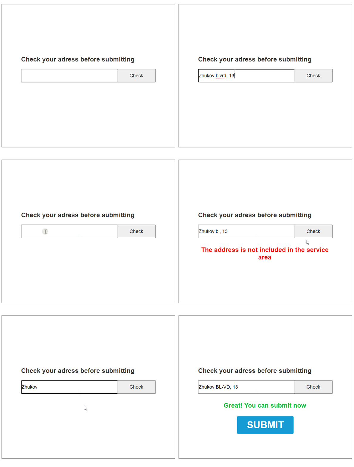
The form just didn’t let a customer use any abbreviations of the word except one right abbreviation. For example, the only correct abbreviation for “Boulevard” is “Bl-vd”. It’s quite an uncommon abbreviation.

It wouldn’t be a critical issue, but weird behavior continues. The user doesn’t see a “Wrong address” type of error. The system shows the “You can’t get service at this address” error. So, it is not only easy to make a mistake. Also, you don’t know that there is a mistake.
But, this behavior is identical for both company’s and partners' landing pages. It couldn’t be the causal factor of the difference in SUM.
And now I want to talk not only about the mechanical behavior of the system. The main difference lies in one tiny detail, which shows the whole nature of the customer experience.
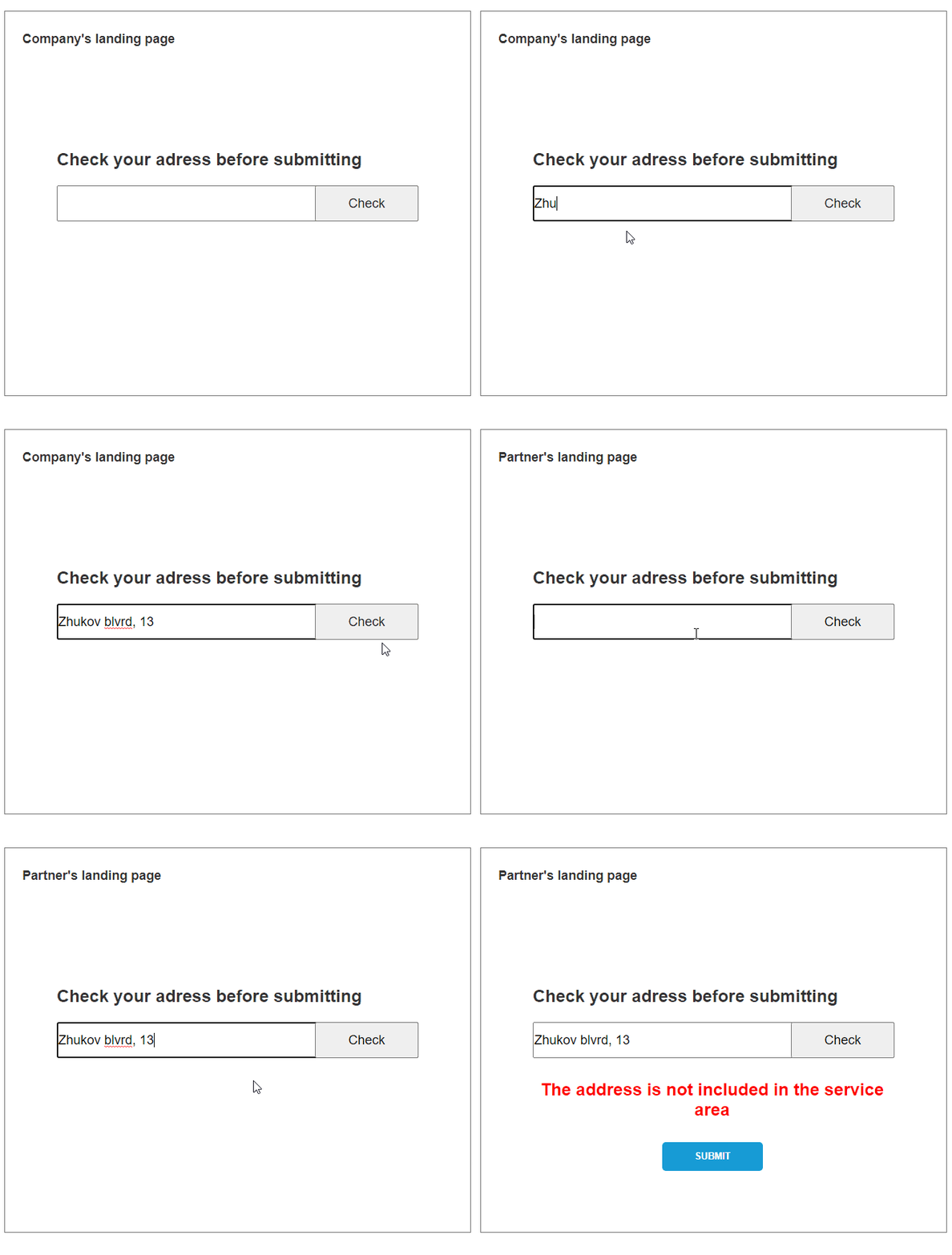
 Partners' landing pages allow a user to request a service even with an address, that was wrong from the system’s point of view. The company’s landing page shows the advertisement of the other service.
Reflection
To let people send the form with the wrong address maybe just a lack of QA. And yes, it’s more logical and right to make the proper error message or make the more understanding address validator.
But even if this small thing is a mistake, it makes the form that is much more usable than the more technically proper form on the company’s landing page.
I love this case not only because it shows my skills in usability analytics. Also because it shows how much some minute trifles in usability could affect the whole product.